 There are numerous styles of lighting, and all depend upon the look and emotional feel of the scene you are presenting. I could go on about high key and low key lighting, but this website is about getting things done quickly (and still artistically) and not getting caught up in a lot of theorizing about what could be done.
The first thing to do when figuring out how to light your scenes is to watch your favorite films in the same genre. Which films have the same look that you are going for? If your film is a comedy, it's best to focus on a comedy, etc. If you you are about to begin shooting an intense, dark drama, and you focus on your favorite comedy film for an "aesthetic look", you could be fighting a losing battle, but creatively speaking, you could be creating something new and enduring as well, so it's up to you. Generally, though, I would suggest studying films that elicit the same emotional reactions that you are going for in your own film.
There are two basic factors in figuring out how to light your scene.
1) Where would the light really be coming from? (A window? Desk lamp? Candles?)
2) What lighting looks nice on your characters' faces?
These are always two internal questions I'm asking myself when I'm lighting a scene.
Today, we'll just focus on the first issue. Although there is definitely an "art" to lighting, there are some basic fundamentals to keep it from looking "fake" and "bad".
Start from a scientific point of view of the scene. Let's say a character is sitting on their couch reading a book on a sunny afternoon. You ask yourself, "Where would the light be coming from?" The brightest spot would be the window. Sunlight beats any interior lighting any day, in terms of sheer brightness. So you let that be your main source of light.
If we are on a low budget shoot and shooting quickly, here is how we light it. We scoot the couch somewhere near the window where we can get an exposure on the character's face or shoulders (i.e., it's not grainy and we can see the details in the actor's features). The window is our main light source, also called our KEY LIGHT. (It can be real sunlight or an artificial light mounted outside the window and out of camera view.)
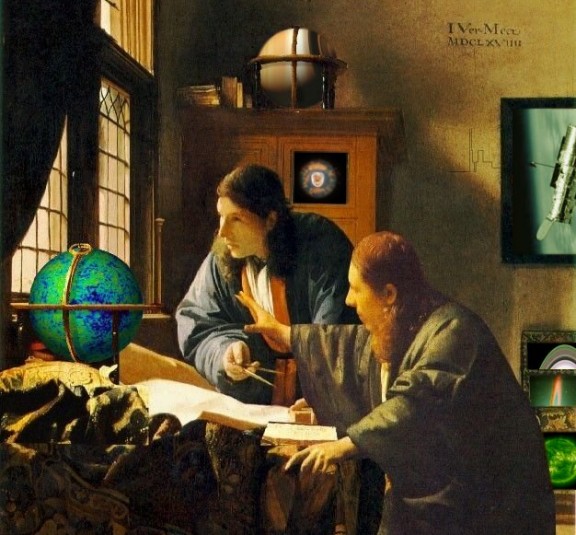
The second thing we are going to do to light this fast-and-dirty scene is to use FILL LIGHT. This is not expensive. A large white board (say 4 feet by 4 feet) will suffice. Look at the darkest places in the frame. Is that okay for your shot? Oftentimes, the character's face will fall into darkness in a situation like this and the way we supplement their face with light is to place the white board (called a BOUNCE BOARD) just outside of the shot, so the camera cannot see it. Angle the board so that it is reflecting light from the window back onto the actor's face. The board could be on the floor, or slightly angled back toward the window. This will give you a beautiful, naturalistic looking shot. All we are doing is boosting the light in the shadowy parts of the frame. In the Vermeer painting below, the bounce light is coming from the white papers on the drafting table. See the glow they are giving the standing character, just under his chin? This light is literally "filling" in the shadows that would otherwise be on the lower half of his face. In brief, it makes the shot "pretty" and a little dreamy, not so gloomy. But if you are shooting a horror film or a suicidal drama of some sort, you may throw bounce boards out the window and revel in the darkness. Film Noir is full of dark shadows, which can be very beautiful, but that's another style for another day. In order to shoot an attractive, modern, slick-looking and digital-friendly scene, this naturalistic style will work wonders.

If you look at some Vermeer paintings, you will see his use of natural light in this way. Vermeer is tremendously influential on modern cinematographers (as you can see in the films of director/visual stylist Ridley Scott, such as BLADERUNNER). His characters are almost always illuminated by a window, and you can see the shadowy part of the figures have a nice bounce light on them, giving them a sort of soft glow. Look at the faces of the subjects in Vermeer painting.
In my next post, I will show a reverse-approach to the same situation.
Happy filming,
Brian
Nov 8, 2007
Cinematography - How to Light a Scene, Part 1
Posted by
B. Nathan
at
11:06 PM
![]()
Labels: American Gangster, cinematography, free film school class, how to light a scene, key light, Ridley Scott, Vermeer
Subscribe to:
Post Comments (Atom)

2 comments:
i liked this site keep working on it
...
ERFUN TV
I like your comments about the use of lighting. While the example does accurately show the use of light and shadow, it is actually a composite of two different paintings, although the same man posed for both of them. If you notice, the colors of one of the men just doesn't seem to fit as well as the colors on one of the globes. Vermeer often reused the same space/clothing/models throughout his paintings. That same window can be seen in many of his paintings.
Post a Comment